|
Context (D)
|
You have produced research, analysis and experiments which show a comprehensive understanding of the subject of music videos. You have conveyed this understanding into a relevant concept and continuously pushed your aims and purpose throughout the project.
|
|
Research (D)
|
You thoroughly undertook research which you independently investigated. This was done over a number of different areas using relevant sources and was synthesised with insightful comments. Ideas clearly developed over the course of the project.
|
|
Practical (M)
|
Your final major project came from a strong idea and resulted in some purposeful pieces of work. There is a clear identity running through all 3 pieces of work, mainly with fonts and colour. You have used new software that you have learnt yourself (Muse) and experimented with different layouts. You achieved the Merit grade by additionally creating new pieces of work using original images and an originally created digital piece.
There is evidence of experimentation with vector images and photography. This has been discussed in reflections with screengrabs are uploaded The 3 pieces of work follow the conventions for the genre and they look convincing
Recommendations for Distinction: · However, you heavily relied on found images. Images of fruit were limited and conventional. · You did say in your proposal that this was a Torbay company but there are only Torquay images used.
|
|
Evaluation (D)
|
End evaluation shows mature thoughts of own work & work practices and self-reflection shows decision-making to develop ideas and compares to other materials.
Reflection throughout blog reflects constantly on what is being trialled and the success/failure and decision-making for future plans is evidenced.
|
feedback 200518
|
Context (D)
|
· T
Recommendations: · |
|
Research (D)
|
· T
Recommendations: · |
|
Practical (P+)
|
Your final major project came from a strong idea and resulted in some purposeful pieces of work. There is a clear identity running through all 3 pieces of work, mainly with fonts and colour. You have used new software that you have learnt yourself (Muse) and experimented with different layouts. To get the Merit grade you must create a new piece of work using original images as you have relied too heavily on found images in your work.
· There is no evidence of experimentation with vector images or photography. This has been discussed in reflections but no screengrabs are uploaded · The 3 pieces of work follow the conventions for the genre and they look convincing · However, you heavily relied on found images. Images of Torquay and fruit have been obtained online. You did say in your proposal that this was a Torbay company but there are only Torquay images used. · NOTE: We require ONE more artefact (Poster, leaflet or Homepage) This must have only original images to gain Merit grade |
|
Evaluation (TBC – D?)
|
· Not yet complete |
Experimentation: Further leaflet experimentation
Experimentation: Vector designs
As part of my project, I wanted to create a vector apple that would be used throughout my project as a small icon or logo. I created this in Adobe Illustrator and here is the progress that I made – below is the reference image that I used throughout the design for some inspiration.

Below is the first screenshot of my progress. My aim was to create a simplified version of the image above without the different colours or without the shading – I just wanted a simple 1 coloured vector image that I could change the colour of using a colour overlay in Adobe Photoshop if I so desired to at a later stage. I started by creating the basic shape of the apple in Adobe Illustrator using the pen tool. I used a bright red colour that would be easy to select and change at a later state.

Here is another stage of my design process – I finished the first stage of my design process with the main shape of the apple being complete. Now, all I needed to create was the leaf of the apple using the same colour and design and then it would be finished.

Finally, I had completed the vector design that I wanted – I then saved this as a PNG with no background and then I used this within my project; I changed the colour to whatever I needed at a later stage in Adobe Photoshop using a colour overlay because this was easier for me than using Adobe Illustrator. I think that this design was very successful and works really well within my project – it turned out perfectly and doesn’t look too realistic, which is good, as I was going for a cartoon-type design.

Evaluation: Final photographs
During my final major project, I was required to go out and take some photographs that would be used on my leaflet, website, banner and my poster designs. I went to the locations that I mentioned in my research and proposal to take these photographs and the results are below:

Here is a photograph that I took on the Dartmouth passenger ferry between Kingswear and Dartmouth – I really like this photograph because it clearly follows the rule of thirds with the sky in the top third, the horizon in the middle third and the river in the lower middle and lower third; I’ve used this photograph for the header of my website.

I took this photograph at Goodrington – I think that this photo works really well because of the fact that it is really bright and captures the natural beauty of the surrounding area as the photograph is mostly natural. Also, when taking this photograph, I used the trees and bushes around the outside of the photograph as a frame for the main aspect of the photo, which is the horizon and the beach in the background – I think that this is very creative and clever and works really well.

This is another photograph that I have taken at Goodrington but this photograph is entirely natural and links back to the idea of being natural, which is the whole point of my project and I think that this photo really shows this. This photo uses active space because of the fact that the swan is on the left hand side and has active space to move into, which is creative and works rather well.

I went to my local Sainsbury’s to take this photograph as I wanted to take a photograph of some bright and colourful fruits for the front of my leaflet – these had to be bright and colourful because they will be used on the very front of the leaflet and I need to ensure that they will attract the attention of a reader from far away when the leaflet is placed in a stand; I think that this photo really covers this and will work really well. Within this image, there is a lot of patterns used that are bright and colourful – this draws the viewer towards the leaflet that it is placed on because viewers are drawn to the photo because of patterns.

Here is a final photo that I took at Goodrington – I don’t think that this photograph is very fit for purpose because of the fact that the sky and overall the colours look very dull; this doesn’t work very well because they would not draw the viewers attention to the leaflet.
I think that these photographs are all fit for purpose and work really well for the jobs that they will be doing within my project; I think that they are all really practical and well shot.
Feedback 14/05/18
|
Practical (P+)
|
Your final major project came from a strong idea and resulted in some purposeful pieces of work. There is a clear identity running through all 3 pieces of work, mainly with fonts and colour. You have used new software that you have learnt yourself (Muse) and experimented with different layouts. To get the Merit grade you must create a new piece of work using original images as you have relied too heavily on found images in your work.
· There is no evidence of experimentation with vector images or photography. This has been discussed in reflections but no screengrabs are uploaded · The 3 pieces of work follow the conventions for the genre and they look convincing · However, you heavily relied on found images. Images of Torquay and fruit have been obtained online. You did say in your proposal that this was a Torbay company but there are only Torquay images used. · NOTE: We require ONE more artefact (Poster, leaflet or Homepage) This must have only original images to gain Merit grade |
Muse screengrabs
Evaluation & Research is D
Need to have website on USB
Practical work is weak
Evaluation: Conclusion
Overall, I believe that this project was really successful. I believe that my work is to the highest quality that I can make it. I have learnt loads of new skills throughout this project and I believe that these will definitely help me in future projects and later on in my designing life. My target audience and my peers are really proud of my project and really like the final outcome of the project and I am too.
I believe that the strongest aspect of my project is the website because it looks really professional – I’ve put the most effort into this website and it was highly praised by everybody that I showed it to closely followed by my leaflet – these were both highly praised by my peers and in all of the surveys that I had created to receive feedback on these designs. Though there are a lot of strong elements to my project I feel like there are some aspects that I let slip slightly and the quality may have dropped – this being the banner design; I feel like I could have improved this design a lot more and spent more time researching existing banners to ensure that I got the most out of this particular design.
Evaluation: What I have learned/feedback
This whole project has taught me so much. One of the many things that this project has taught me is a handful of Adobe Photoshop design skills; it’s taught me how to use photo filters in Adobe Photoshop to brighten a photo rather than adjusting the brightness/contrast and I’ve definitely learnt a lot about what layouts look the best for certain types of projects. The best thing that I have learnt from this project is the use of a completely new piece of software and that is Adobe Muse; through the use of tutorials and help from my peers I have managed to learn this program over the course of this project and it enabled me to make a much better and interactive website than I could have ever created in just Adobe Photoshop.
In terms of practical skills I have learnt how to edit photos professionally in Adobe Photoshop and how to create amazing vectors inside of Adobe Illustrator and them move them between software and this has really helped me with my project. For the theory side of this project I have learnt the importance of contextual research and how much it can actually help me during a project; I’ve learnt the importance of doing research in general also as this has really helped me during the project because research allows you to see what parts of your project are likely to work and what parts are likely to not. I am proud of what I have learnt over the course of this project as I have definitely learnt a lot.
Finally, I made a survey for people to fill out to give me some detailed feedback on all of the finished products that I had created so that I could reflect on this and see any improvements that I should make to my products. It allowed me to find out what people actually liked and what they did not.
Here are some screenshots of the final website design that I created:


I asked for some feedback for these screenshots by using a survey, the results are below:

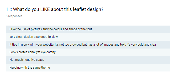
From this question’s feedback I have learnt that people seem to like the colour scheme that I have chosen with one comment stating that it’s “fun but not too childish” – I agree with this and I am really pleased with the overall positive feedback that this question has received as it appears that people like my website design so far.
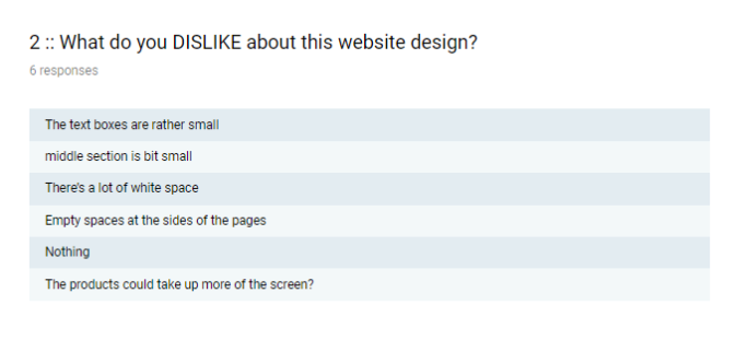
In the next question I asked for some critical feedback – I asked people what they did not like about this website design; I asked this question so that I could find out what the negative points about my website are and where I have room for improvement. This really helped me because it allowed me to clearly see the parts of my website that people do not like and it allows me to pin-point what needs editing or changing. It appeared that people believed that the text on my website was too small and that it should be larger and overall it appears that people believe that the content is too small on the website and I agree with this.
This question allows me to see the exact changes that people would make to the website 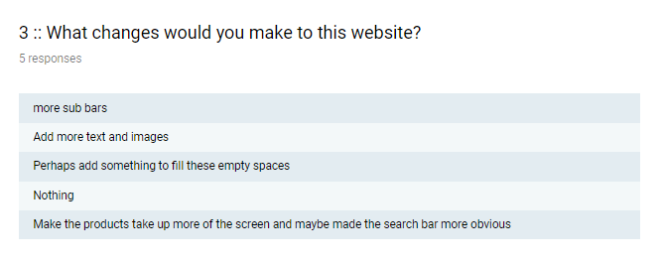 if they were given a chance – this question allows people to tell me exactly what they would change on my website which really helps me – I can now see the exact things that people do not like and it ties in nicely with the previous question because the 2 questions allow me to see what people don’t like and how they would change it. The majority of the answers to this question mention filling up the white space around the outside of the website and I disagree with this comment because the white space is where because I am using a larger monitor so I do not believe that these are valid comments.
Next in the survey, I asked for some feedback on my final leaflet design, the image is below:


Using the same question format as for the website, I asked for some feedback on these 2 leaflet designs and the leaflet as a whole, these are the results:
This question has shown me that people like the colour scheme and the shapes that I have used throughout the leaflet. People also seem to like the consistency between this leaflet and the website that I have created too. This shows me that the design is pleasing to most people and that it works really well – people think it looks professional, which is what I was trying to go for. I have learnt that these colours work really well to portray the idea of healthy eating and being organic and that people like the use of photos throughout my leaflet and website so far.

Again, in the second question I have asked for some critical feedback on my leaflet design and this is so that I know exactly what people don’t like and would like to see changed. The criticism for this leaflet design appeared to surround the layout of the text on this leaflet and I agree with these comments – they are saying that there is too much text on the leaflet and I agree, I should experiment with different text layouts rather than just having the text laid out in a block paragraph format.
This question is really helpful for me because I can clearly see what people want me to change based on their answers to it. The response clearly shows that people would change the text if they were given the opportunity because of the fact that it can be hard to read both due to the layout of it and due to the colour of it and I completely agree with these comments. As mentioned earlier, I should experiment with different text layouts and perhaps implement a different colour for paragraph text such as grey or black because this would be easier to read – I should break up the text into smaller chunks so that it is easier to read.
Next, I asked the same questions in the survey but for my banner design, which is below:

Here are the results for the questions that were asked on my survey about my banner design:

The results for this question are very similar to those that are on the previous design in the sense that people seem to take a liking for the colour scheme that I have chosen and some are describing it as “colourful and eyecatching” – which is perfect for my banner design. From this, I’m learning what colours work well on banners and posters and what colours don’t and there appears to be a lot of positivity that surround this colour scheme so this would definitely be a colour scheme that I would consider using on future projects of a similar nature.

There was a lot of mixed feedback for the second question, there was a lot of aspects of the banner that people didn’t seem to like. One said that I could have used an “actual photo” rather than just using the vector images that I used in this design – I agree with this, as I believe that I have left a rather unnecessarily large gap in between the icons which one person did not like but I agree with them. Another has said that the text could be hard to read which links with my previous comments of possible experimentation with different font colours if I was to do this project again as I think that, yes, the font could be considered hard to read at certain points in the project, especially from a distance.

I asked people what changes they would make if they were given the change and all of the comments involve changing the text – most of the answers involve increasing the size of the sub-line text and I agree with this comment because the text could be considered hard to read from a distance when the banner is printed and used in real-life situations so this is something that I would definitely look into changing in the future.
Finally, I asked the same questions one last time for my poster design, this is below:

When I asked the same questions but about this design, the results were a lot different because I decided to go for a different design style when making this poster. Here they are:

On the first question, it’s clear that people like the simplicity of the design and the image that I have decided to use for both the center of the poster and of the background. One comment mentioned that they like the fact that the poster has “good contrasting colours” and many have mentioned that they like the apple in the center – it’s very simplistic and it works very well as a poster in my opinion, so I agree with the positive feedback.

For the second question, all 4 of the answers read “nothing” or the question was simply just not answered – from this I can gather that people could not find anything that they did not like within this poster design which is really good and it shows that the design is effective and has little-to-no flaws within it. One comment was later made about the font and how the bottom font is “too boring” – which I agree with and I should experiment with some different fonts on the poster but I wanted to maintain consistency across all of the designs. 
Finally, when asked what changes people would make if they were given the chance they would either change “nothing” or they said that I should experiment with real images rather than just using vectored images – and I agree with this because it adds a natural aspect to the poster rather than it all being vector images.
This feedback has really helpful for me because it allows me to see what people really like and really dislike about my products and it shows me where the room for improvement stands.
If I was to attempt this project again, I would ensure that I experiment more with different colours to avoid repeating the same colour scheme and same fonts throughout the design and I will be sure to not be scared to experiment with some variation and not be afraid of breaking the consistency. Also, I will be sure to complete some more analysis to avoid getting stuck on designs – this will help me have some more creative ideas and will allow me to broaden my design skills.
Evaluation: What went well & improvements/changes
During the development of my project I ended up making some changes to the original proposal of my project – this is because as I experimented with some of the original ideas I realized some other ways that I could get the best out of my project.
One of the things that I decided to change was the proposal for the banner that I would design. My original proposal stated that the advertising banner that I would create was going to be placed on the website to advertise a new product range or part of the website – the banner was originally going to be digital and not a physical product. However, when I started designing the website and the banner at around the same time I realized that having the digital banner was not really necessary within my project. I really wanted to design the banner as part of my project so I made the call to make this a physical banner rather than a digital one because this would have more real practicality over the digital one and I think that I made the right decision. In my original proposal, I stated that I was going to use the colour dark green, dark grey and a set of specific fonts throughout because these are colours that I thought would work really well when placed on the website and the leaflet together, however, once I started the design for the leaflet I immediately realized that these colours did in fact work well together, however, they definitely were not practical for the project that I was creating as they looked too modern and bold for my style – I needed to use softer & lighter colours for my project; I quickly changed these colours to the turquoise and white colours that I am using now and I definitely think that this was the right decision for me to make. I think that both of these changes were definitely necessary and I am glad that I decided to make them – after I made both of these changes I updated my proposal so that all of my work was up to date and accurate.
I believe that the whole of my project is effective at what it is trying to do but there is certainly some parts that are more effective than others. For example, I believe that my analysis of existing products was the most effective part of my project because it helped me a lot more than I ever thought that it would; this analysis allowed me to gather some inspiration from existing products and made the whole designing process for my own products a lot easier than it would have been without it – it allowed me to see what aspects of design worked better than others and it allowed me to experiment with certain designs that I had never thought of experimenting with before. Another part of my project that I found to be successful was the website experimentation section – this is because I had never really touched on website design until this section of the project and I was eager to get started. During this process, I learnt so many new skills and tried out a new piece of software, Adobe Muse, to create my website rather than Adobe Photoshop and I do not regret this at all. I learnt so many new website design skills throughout this section of the project and these will definitely help me with later projects and definitely later in life.
Evaluation: Problems that I faced
During my final major project I came across a few practical and theoretical problems that I had to overcome in order to continue – some of these problems were worse than each other but they all definitely had their effect on my project. During the research portion of my project I came across a few problems with the sources that I had decided to use and the topics that I decided to research.
The first problem that I came across was during the contextual research of the healthy food store; there was not many sources at all that talked about this topic and I had to spend a large chunk of my time trying to find some information on this topic and I decided that I wasn’t able to do it on my own, so, to overcome this topic I had to ask my peers for some assistance in looking and after some teamwork-research we were able to find a very limited source for my research and then I was able to complete my contextual research on this topic.
Another theoretical problem that I came across was the fact that I was unable to complete a survey for the correct age group due to the lack of time that I had for this section and the people that I knew and therefore I was unable to survey the correct group of people. To overcome this problem, I had to complete another survey but I had to gather results by posting the survey online for people that I did not know to complete; this fix worked rather well – I chose to fix this problem using this method because I needed the research to continue and I only had a small time frame for this research.
I also come across some practical problems too. One of my practical problems was the fact that I was unable to come up with a suitable poster design after trying for far too long, this was a fairly hard problem to solve but I managed to overcome it in the end; firstly, I did some additional analysis of existing healthy food poster designs that I had found both in person and online too – I found this very helpful when trying to combine different aspects from existing material to create my own professional design and this attempt at solving the problem worked surprisingly well and I was able to start designing though I started to struggle again later down the line when designing so I simply asked my peers what their opinion on my work is and what changes they’d make if it was their design and then I experimented with these designs until I found one that I like – I chose this approach because it was an efficient and practical approach and it worked really well for my whilst adding to and developing my researching and analysis skills.
I came across another problem which impacted the progress of my project too – this was the weather at the locations that I needed to go and take photographs at. When I got to the locations or when I was available to take photos, the weather was usually moody or too dull for the photographs that I wanted to I had to hold back and try again another day and this meant that my designing was slowed and gaps were left where the photographs needed to go. In the end, I took the photos no matter what the weather was and then digitally manipulated them within Adobe Photoshop and adjusted the vibrancy, brightness or whatever I needed to in order to make them work. I chose this approach because it meant that my photographs were not effected by the weather and I was able to continue on with my project in a timely manner.
I am proud of the way that I handled these problems that I faced during this project and believe that I did so in an effective and efficient way and nothing developed into a major problem as a result.
